Created to practice lighting and colour:
First test i did just to experiment with light and shadows. Used 3 point lighting.
3 point lighting, dull colours and light is not too bright to create the effect of a dull day. Thought about what the colours would look like, darkened, de-saturated. Shadows aren't too dark or long and there is not much sun light to create them.
Same 3D scene but changed the colours to make them brighter and also put the intensity of the key light (sun) up to make it brighter. This made the shadows darker and created the look of a sunny, brighter day.
2D image created in Photoshop to look at colour scheme, set in the morning so sun was still low. Brown colour scheme and rays of light coming over building on left. Done with reference to a photograph i took. Background buildings almost in silhouette due to it being further away.
First attempt to create a night scene. Turned out to be different from the sketch and photograph but useful to practice creating lights for a dark scene. Only basic colours used, no textures so nothing really stands out or draws attention. Key light is moon light which is an area light, made blue with an intensity of 0.900. Depth map shadows are on with a resolution of 512. The street lights are made with a spotlight with a slight yellow colour and the intensity is 0.500 with a drop off of 20.00. There are no shadows coming from this light. One was made then duplicated to each lamp post. However i think this could be improved as it is not dark enough for it being at night time and street lights aren't lighting the scene enough.
Second attempt at night scene, changing the lighting attributes. Moon light is still an area light but blue is now darker to make the scene darker. 'Emit diffuse' is turned on because i found with it turned off it made everything too dark and could only see spotlights, not buildings or lamp posts. Depth map shadows are on to create shadows from the buildings but they aren't seen very well. The street lamps still spot lights but the intensity is now 0.700 and the yellow is brighter. Again there are no shadows from this light as everything would be too dark and might create second shadows from objects. the drop off is now at 10.000. I think this is much better and looks more like a night scene. the street lights look more they should, lighting a bigger area on the ground and even the lamp post itself. i m happier with this image after i went back to it to improve it.
Modelled the corner of my room and used different materials, being blinn and phong. Phong is used for the bed post to get highlights as it is shiny. Blinn is used on the drums to reflect light and get highlights. The key light is a point light as it acts as a bulb and lights in all directions and also casts shadows. The colour of the light a is a very light grey/white with an intensity of 0.800, the shadow colour the grey and depth map shadows are on. The filter size is put up to 4 to make softer shadows and blur them slightly. The fill light is a directional light to help make bounce light and illuminate the sides of objects facing the light. There are no shadows from the fill as it can produce second shadows, the intensity is lower than the key, 0.400. A back light is also used to break up the image and add depth but in my opinion im not sure it was really needed in this image. There are no shadows from this light either as it took away the specular highlights. This is a directional light. I am pleased with this as it is meant to look like the room is lit from the light bulb in the room and i think it does that.
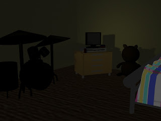
I then used the same scene to make the room look like the light is shining through a door way from another room. the colour and materials were not changed, only the lights. This time the key light is a spot light as it also acts like a bulb and creates bounce light, it is aimed at the corner of the room. Its intensity is 0.200 with a dirty yellow colour. The cone angle is 60.00 to make sure the light didn't come out as a perfect circle in the wall and the drop off is 30.00 to decrease the intensity from the centre to the edge of the beam and the filter sizeis at 2 to produce sharper shadows as the light is further away this time. The fill light is now also a spotlight with no shadows but the colour is a dark blue to make the room dark and the intensity is only 0.100 as this is a dark environment. Back light is still a directional light which faces the drums with a dark blue as well to add to the darkness with an intnsity of 0.200 and depth map shadows with a filter size of 3. I am happy with the shadows of this work but i do not like the look of the drums as there should be some light hitting them giving it a highlight but they look very flat, as well as the bed post. I found it a bit harder to create a dark room with a hint of light coming from another room but was useful to learn how to do this.
Using the image for a dull day i attempted rain, i looked up a few tutorials and there were a few trial and errors but this is what i got to, i'm pleased with it considering it was my first attempt at it and gave me ideas to try more things with weather in maya to help give an atmosphere or mood to the story.
Practicing with light for the respected theme:
- I am happy with my media tests because i think most of them show what i wanted them to, time of day, sunny/dull, how different lights affect objects and shadows but i realized that my tests do not say anything about characters or people who might live or work there. Also they do not tell a story so now the aim is to use my photographs i have taken to produce work of buildings and environments that do help tell a story as that is my project and also try to make them say something about who lives or works there if anyone and if there is any life connected to the environment.
Semester 2 media tests:
Practicing with light for the respected theme:
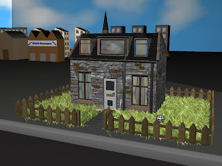
Once the models were referenced into one scene i started to light the scene. In this theme the lighting is meant to be brighter, as if it is a sunny day, creating a happy feeling for the positive theme. 2 point lighting was used with extra directional lights but this made the grass too bright. so then had to turn some lights down and rotate them. It is also noticed the grass is too long and needs shortened.
After moving some lights and lowering the intensity the brightness of the grass was solved but i feel the image looks quite flat as there are no shadows present. And the background buildings are in bright light which is distracting.
More work was done with the lights, this time a spot light was used for the main light, being the sun but again the grass is brighter and so it the background, the house does not stand out so i am still not happy with this, more work still needs done to create shadows and have the house stand out as this is the main focus in the environment.
Practicing with light for neglected theme:
This is third test produced, i feel the shadow has improved since rotating lights, and turning the intensity down on each light. However the spot light it too harsh so the drop off would need adjusted and also the grass is too bright but it is improving each time i work with the lights.
Practicing with light for neglected theme:
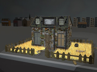
Once the respected theme had a camera in it and it was rendered out the assets for the neglected theme were referenced in and i then loaded in the material for the sky which it a grey cloudy colour. The intensity of the key light and other directional lights were turned down slightly to test the lighting but all of the directional lights were still too bright and caused a shadow/texture effect on the ground which should not be there. There are also dark shadows on the ground behind the house which look like they are coming from nowhere. The lighting is un-natural as it seems too bright for the negative theme and the grey sky. The grass on the right side of the building is a lot brighter than the left side which should not be happening either, it is the same grass so i think this may be due to the lights being too bright.
In the second test with lighting in this theme it is less bright and now created a shadow from but as it is meant to be a grey, cloudy day there should not be dark hard edged shadows so i still wasn't happy with this because the shadow's edge is too hard and too much of the light is illuminating the background buildings. I wanted them to be in the background and not lit up so much so the viewer concentrates on the house but the side of the house is too dark so the fill light needs turned up a bit. The brightness of the grass was solved in this test as well as the dark shadows on the ground creating the texture.


No comments:
Post a Comment