Monday 13 May 2013

Honours Project Portofolio - the process & final piece of art

Final poster for honours project.

After changing the research question and aim of the honours project through out the year, the final aim was to visually communicate character and theme through environment design. Once the aims and objectives were laid out i came up a set of criteria to research to carry out an exploration in environment design. It started broad and narrowed down to a short aim, as seen on the aims and objectives page. The research question came about by creating a jellyfish of ideas to ask questions i want to find out about and then looked for themes or words that came up over and over again. By doing this i was able to set activities for myself, for example reading on environment design and watching films to study.
Jellyfish of questions


I was mainly interested in environment design for film and also storytelling and was inspired by old buildings, especially the run down ones that look as though no one lives there. I think this was due to seeing an old derelict building and not knowing what it was or the type of people who belonged there so people make up their story and start to wonder what kind of place this was and why it now the way it is. I was in Barcelona and went to see Gaudi's famous building that was never finished called 'Sagrada Familia' and was fascinated by the shape and detail on it and tells the story of Jesus. This was an inspiration to create my own environment to tell a story but as the project developed i realized i was trying to convey theme more and did not really need a story as i wanted to create an old run down building. The idea needed developed more so i could make progress so after getting feedback in presentations i was able to go and think about the criteria i was to study and get some knowledge on each theory. The theories i studied were colour, light, texture and composition. This helped to develop an understanding of production design and was able to start doing media tests after the reading. 

I started to study films more and started a case study on Finding Nemo but never finished it as i realized it didn't relate to my project at all because the colour and light used was for underwater scenes where as i was not doing anything with water.

Photographs were a huge part of the project as i took my own photos of buildings to get ideas for shape and what i could include in my art work. They were useful for looking at colour and light and also took photos for textures such as walls, the ground, and wood.

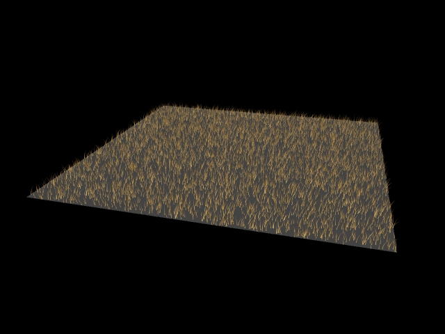
After studying films and photographs and taking notes from books on theories it was then possible to create some media tests to practice with light because i had not done much work with lighting before. I am not happy with the first media tests created in semester one due to the fact they don't relate to my project, it mainly shows i was practicing with light rather than test each theory. I feel like they could have been improved if i had spent more time on them and tested each theory  instead of jumping into the project too soon because my idea wasn't finalised i just started making things to test out which does not show any theory or why i practiced with lights. However once the assets were made for the final idea i started to test them with texture and as shown on the issues page i had some troubles with texturing and had to look up tutorials on it as i did not know as much as i thought i did. Once the environment started to be composited i put some lights in and tried to create a believable day scene, one being a bright sunny day for the positive theme and one being a cloudy dull day for the negative theme, these tests were a great help in looking at how my lighting was not natural and needed changed and how it affected the colours in the scene as the bright light drained the colours and made them too bright they were almost white in some cases, like on the grass.
After some testing the final piece of art started to come together.

Instead of the Finding Nemo case study I chose to do one on 'The Incredibles' and one on 'Despicable Me'. It was interesting to see how different studios showed villains and how they used colour and light differently. Looking over the write up of them i tried to apply what i learnt in my work.


This is final render of the respected and cared for theme. There is depth of field applied to the camera, the background buildings are slightly out of focus but i feel they could be more out of focus to emphasize they are in the background so they don't distract the viewer. I also feel the grass a bit bright but i had problems with this due to the lighting. The toys in the garden aren't as noticeable as i had hoped they would be. However i am happy with the overall look of it as the textures show up well, they are not too harsh but still make it believable as a house. I like the wooden fence as the knots in the wood can be seen, i spent a lot of time in Photoshop making sure they would be seen on the model. I think the environment does show that the characters who belong here are tidy, they look after their house and garden. There are blinds and curtains up in the windows the the toys are carefully placed in the garden, for example the scooter is leaning against the wall and the football is clean and the doll is lying at the door as if she has only just been left there a short while waiting to be brought inside. The lighting creates the afternoon effect, it is bright and creates a hard edges shadow behind the house but it could be improved by not having the circle of the spot light so harsh to the left of the house.


This is final render of the neglected and deprivation theme. The depth of field was not changed for this scene as the focus should be on the house, the background buildings are the same as the respected theme. As mentioned there were issues with the light and the grass making appear bright so after adjusting the lights this was the best i could do with the grass but it could have been toned down a bit more but still gives the idea it is dead and overgrown. The toys in this scene are noticeable which is what i wanted, the doll has been left outside and has been drawn on and missing an arm,a leg and an eye. This was important to create when modelling her even though it is not noticed. Also the scooter is rusty, has chunks of foam taken out the handles and is dirty, this isn't as noticeable either so if there was more time i would have used different camera angles to show them. I am happy with the overall look of the house though, i like the smashed window, the dirty ones and the one the bottom is boarded up. the house is distorted showing it is falling to pieces and there is a crack in the wall above the door. The door is broken, its slightly distorted and the paint work is peeling off. the fence shows the garden is neglected as it is broken, there's panels missing, some have fallen off and never been repaired or picked up and there is moss growing on it. The toys show the kids neglect them and the family is deprived as they don't fix their house or look after it.

Although there were technical problems throughout the project i enjoyed the experience and i am proud of my work. There are improvements which could be made as stated but i have learned a lot from the research project and 


Sunday 12 May 2013

Issues With My Honours Project

There were some issues that came up throughout the project and those were mainly with texturing and rendering.

The first texturing problem i came across was the texture appearing on the wrong parts of the mode and came out really small. After getting some help from my supervisor i realized this was due to the unwrapping. I had not uv mapped the object properly, in the uv texture editor i had the shells over the whole editor which would mean it was set up for four textures instead of the shells being in the snapshot which is set up for one texture. This is what caused the texture on the scooter to appear in several places.  I went back over the model to unwrap it properly and re texture it.

After unwrapping the model properly i still had an issue with the texturing because the wheel texture was appearing on the wrong parts of the wheel. This was solved by using the uv linking and uv centric tool to make sure the correct texture went on the right part of the model. This helped out in every model i created for the project.

There was a problem with the bump map on the wall of the house, it appeared on the walls fine apart from the top of the side of the building, this was noticeable and needed fixed, i tried to delete part of the bump map in Photoshop and re apply it but this didn't solve the problem. Within Maya i had taken off the bump map and re applied it and it came up but not as clear as the rest of the bump map on the walls so i reduced the bump depth to make it less harsh and adjusted the pre filter radius to get a smoother result, this blurred it slightly.

In the respected theme there was a lighting and composition issue, the buildings were not on the ground, they were floating making the shadows unrealistic as they were not coming from the building, they weren't joined to the building causing the shadow. All of the lights were too bright which affected the grass, it was too bright which made it look almost white and this was distracting. This was solved by adjusting lights and removing the directional light and using a spot light instead because the directional light lit up the whole scene and the spot light only lights part of it which is what i wanted. 


Another issue i had was with rendering. I had planned to render with mental ray as it is faster with rendering and is production quality rendering but when the scene was rendered none of the bump maps showed up making the house look flat and have no detail and the grass wasn't showing up in the render either. Instead of rendering with mental ray i chose to use Maya software rendering so the grass would show appear in the scene as well as the bump maps. the only down side of this was that mental way was to show the lighting better. 

Personal Development Portfolio


Personal  Development Portfolio

To be able to complete the project of exploring how a production designer can visually communicate character and theme through environment design there some skills and knowledge gaps which need to be filled.  A set of criteria will help to define these knowledge gaps.  Skills gaps would be on the technical side of the project, in Maya and knowledge gaps are mainly on the theories of the project.
                The theories being studies for the project are colour, light, texture and composition. Books were taken out to fill in the knowledge gaps on the theories and notes were taken on them. Throughout semester one it was useful to read books on each theory, even though the research question and aim changed throughout the year the theories remained the same. Knowledge gaps consisted of colour, lighting and production design. As I knew that random colours were used in environments I did not know why colour was used and had to read up on meanings of colours and how they add to the mood of a scene.  With the case studies I wasn’t sure where to start but after sitting with the set of criteria it was a lot easier to take notes on the films I was studying. Lighting was a big knowledge gap as this is important in environment design, it helps create mood and atmosphere but I was not sure about colour of light or the type of lights within 3D environment design so reading books on light was a great help as I did not know how to light a scene if there was not a realistic light source, I found that often scenes are lit by emotion so it is still possible to light a scene if there is no main light source. It was important to learn more on shadows and lighting a cloudy day as this was part of my project for one theme.  To cover the theories for the project I had to learn more on production design as I wasn’t sure of everything that was involved to production design books were just as important a books on the theories as they has information on the process as well as the theories I was studying.
                There were more skills gaps than knowledge gaps within the research project, consisting of texturing and lighting. Texturing was an issue because when a texture was applied to a model it was upside down and on the wrong parts of the model and one piece of texturing appeared to be on several places instead of one. This was due to the uv mapping being wrong because I did not have the skills or knowledge to uv map so the textures were wrong and stretched. The reason for them being wrong on the model was I had not changed the settings in the snapshot menu and had all of the uv shells scattered instead of them being in the space it was set to snapshot at. To solve this and fill the skills gap, I unwrapped the objects again and used a checker map to see if the textures were stretched or distorted. It took a while to re-do the uv mapping I learnt a lot from it, for example using the uv centric took to apply the correct texture to the correct part of the model. As mentioned before lighting was a knowledge gap and also a skills gap and I hadn’t used lighting in Maya a lot so a lot of it was trial and error. A book called ‘Texturing and Lighting’ was helpful when doing lighting, in my media tests 3 point lighting was used but this was not very realistic at all when creating sunlight and bounce light from the sky and other objects.  To fill this skills gap, practices were done with the final models and uploaded to my blog to describe was what happening with the light and why it was not working.  A major skills and knowledge was rendering because the plan was to render in mental ray but when the scene was rendered the bump maps and alpha maps were not showing up. After realising that mental way was better for lighting but not for textures the decision was made to render in Maya software to have the textures show up as well as the light because textures play a large part in making the models believable due to the fact they show dirt, bricks and slates so it was important to keep the textures showing.
                The sources used to address the skills and knowledge gaps were books, films, online tutorials and media tests in Maya and Photoshop as a lot of the project was trial and error to get the environment looking the way it should. The plan was reading books and taking notes on the theories to use in my own work, then watching films to look at how other artists created an environment with those theories then media tests while looking at the tutorials. The studies of films were very useful to take notes and then try to use what I learnt in my project. This did not work out as planned as the books were read and notes were taken and tutorials were identified but I jumped straight into media tests without having enough knowledge which is clear to see in the tests. The tests were created before the research aim was finalised so this had a big impact on the development of the work because I did not have the knowledge so this meant I relied on notes and tutorials instead of learning from mistakes made in the media tests. As I felt a bit lost in the project I did not know where I was going with it so after it was finalised I started to create assets for the environment which were tested with texturing as this was not covered in the early media tests, and also when it came to lighting this took a lot of testing so there were media tests made, but later on the project than intended. The tests were uploaded to the blog where is a critical commentary on the work produced.
                Overall the development plan for the project did go well as the skills and knowledge gaps were addressed which solved problems I had due to not being able to do some of the work as I didn’t have enough knowledge on the theories.  Each gap was worked on throughout the year to improve my knowledge on production design and the theories of colour, light, texture and composition, however composition was not studies as much it should have been.
                To critically reflect on the professional development I would say I am happy with the final pieces of art I produced as they address the aim of the project. However the project was slow getting started due to it changing twice but it was always to be on environment design and the theories never changed. I gained a lot of knowledge and skills throughout the project but I do believe that the work could be improved having more knowledge on each theory. Although there were technical issues they were all solved to be able to complete the project of the environment communicating character and theme. The submission deliverables consist of renders of the media tests, the wrote up of case studies, sketches of ideas and photographs, notes on media tests which were examined, the project diaries, the final piece of artwork produced for the project and all of the production files such as Maya files, unwraps and Photoshop files with the textures and also the dissertation. 

Wednesday 8 May 2013

Honours Project Portfolio - 3D work - Final models

Final models that are in the project for the respected theme:

 Background buildings for behind the house in each theme, one set of buildings were used, they were not changed because the focus should be on the house and it's changes rather than the background.

 Football for in the garden, still clean, indicates it is new and looked after. Material used - blinn to make the ball look skiney.

 Doll that is left in the garden, missing some clothes but she is clean and has all her limbs and eyes.

 Door for the house, stained glass windows in top and bottom. Golden coloured handle and letterbox, both are have a specular highlight.

 Fence for around the house, has two different wood textures with knots in the wood.

 House in respected theme, roof and walls have bump maps, the gutter has a small highlight at the top. Bricks pushed into the walls to make it look more 3D. Frosted window in the middle upstairs for the bathroom and all of the windows have curtains up.

Micro scooter, another toy that is left in the garden, shiney, clean wheels, looked after as it is not dirty or rusty and has foam handles.

Grass for the garden, green, healthy looking and short. It clearly gets cut and it looked after.  

Final models that are in the project for the neglected theme:

 Dead grass, brown/yellow colour and not much of it, it's not looked after, just left to dry up and not cut.

 Deflated football, has mud on it, missing pentagon shapes, deflated can show it's quite old and well played with or just left outside to get dirty and has no air left in it.

 Wooden door for the house, paint has started to peel off from the wood, rusty handle and letterbox. Letterbox has a hole in it and the door itself is slightly distorted to show it is broken, has rotten wood and never been fixed but clear to see by the state of it that it has been broken for a while.

Fence for around the house and dead grass, panels have fallen off the fence and just left on the ground, no one has bothered to pick them up or repair it. Some are on their way to falling off as they are hanging to the side really to fall off. Some panels have moss growing on them. 

 House in neglected theme, the walls and roof still have a bump map, the gutter is rusty from a leak. There are still bricks pushed into the walls to create the 3D effect but they aren't as noticeable due to the dirt and moss on the walls which have a noise filter on them to add texture. the frosted window in the middle is dirty and also the window on the right upstairs. The left window upstairs is smashed showing it might have been a recent smash because the downstairs broken window has been boarded up.

 Scooter to be abandoned in the garden, chunks of foam out of the handles, it is rusty and the bottom of it is dirty.

Broken doll to be abandoned in the garden as well, just left thrown down in the grass. has one hand, a leg and an eye missing and she has been drawn on. The owner did not look after her, she was drawn on and then neglected.